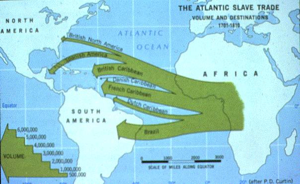
Animated graphic depicting the African slave trade, part of Slate's ongoing series. Based on the Eltis and Richardson database, with proportional-size dots for the number of kidnapped people per ship, it depicts the movement of 20,528 voyages in two minutes. Who went where, when, seen as a flow.
This makes clear how few Africans were brought to Colonial and U.S. shores, in proportion to those taken to the Caribbean and Latin America.
By the way, briefly after the end of the War of Independence, and then particularly after the War of 1812, a huge percentage of these captives were brought to the Caribbean and South America on ships flying the U.S. flag and carrying U.S. papers.
Subscribe to:
Post Comments (Atom)


No comments:
Post a Comment